Overview
Refresh the current mobile app experience with a visual redesign and improve workflows.
Problem
- Limited branding opportunities for market differentiation among our 600+ customers
- Bare-bone workflows and structure especially for accounts page, account history page, and bill pay.
Role
I served as design lead for the iOS and Android teams which were made of front and back-end developers, QAs, and one PM. I also partnered with our User Research team to collect data on various workflows and on aspects of the redesign.
The Process
Going Broad with a competitive analysis
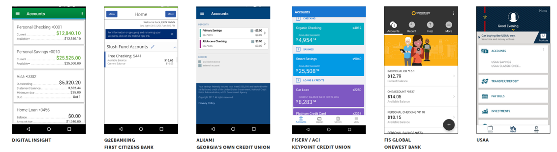
Mid 2017, our team conducted a comprehensive competitive analysis that noted the differences in our digital banking product (mentioned as Digital Insight) and its competitors in order to provide recommendations on improvement.
This in conjunction with feedback from customers and our end users was a great starting point to help identify any major gaps that should be addressed within the redesign.
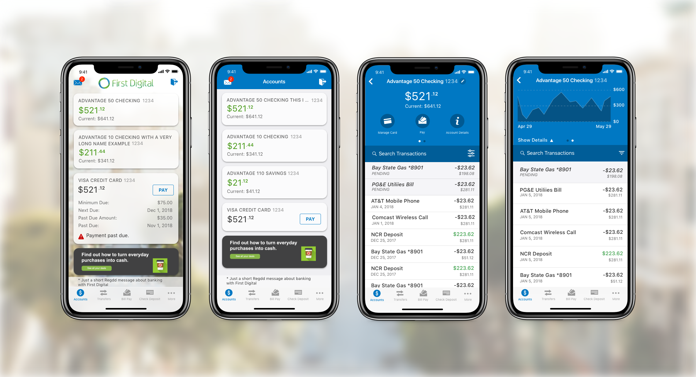
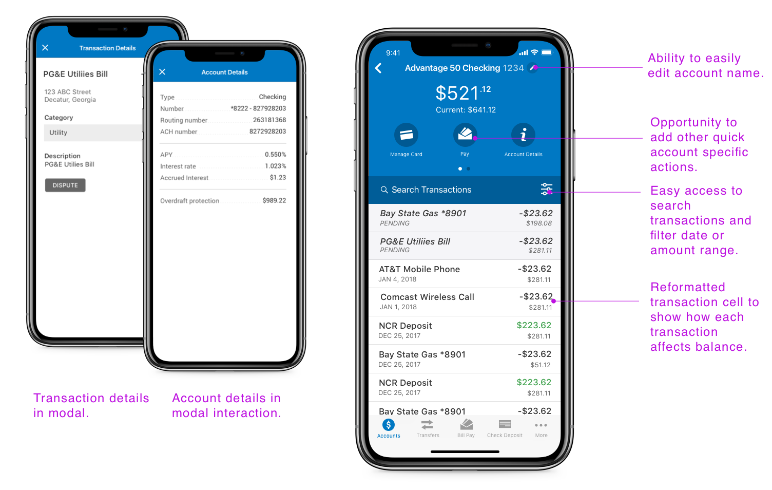
The Accounts Page
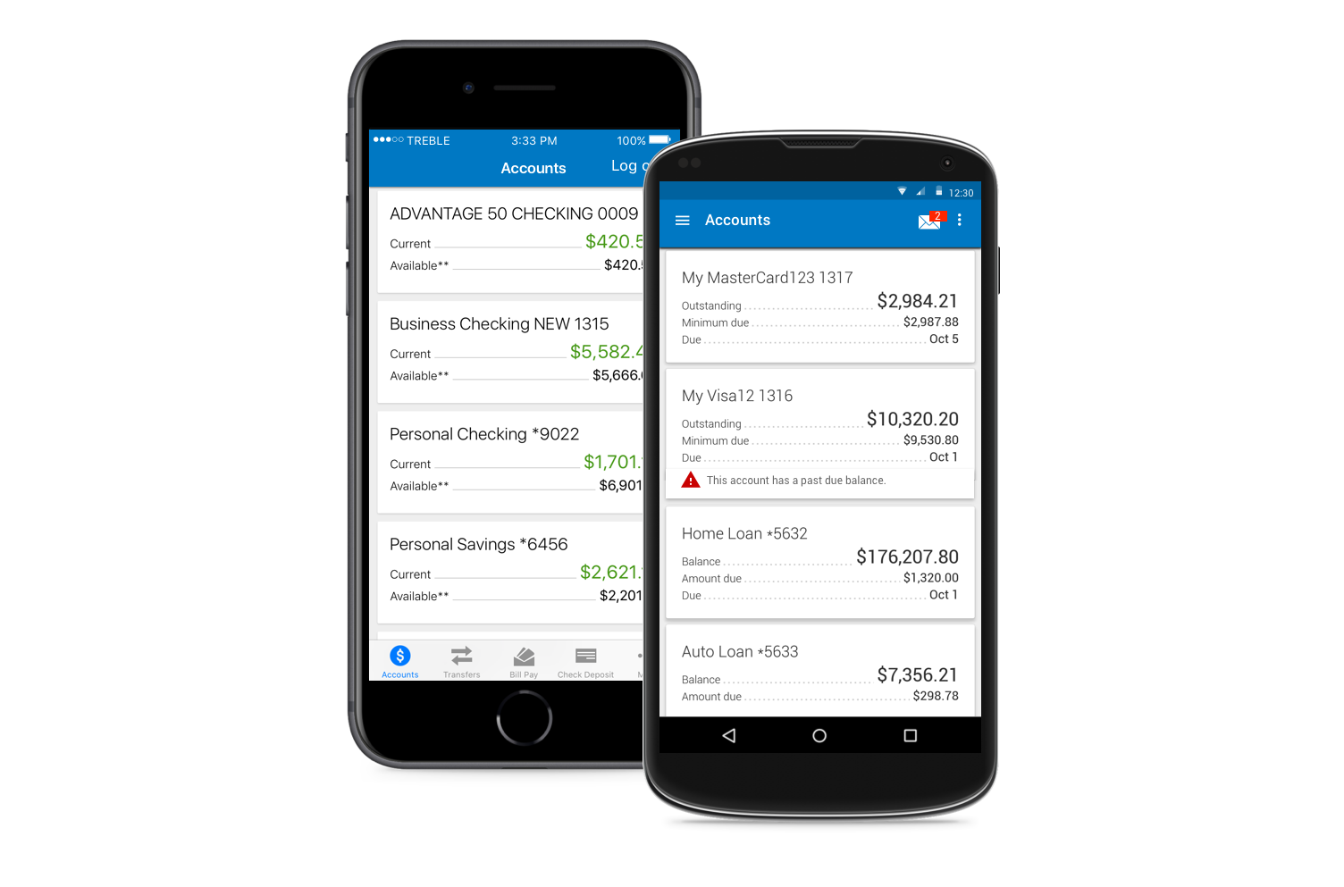
This screen is essentially the homepage and indicates the accounts and the balances. Unlike our iOS product, Android uses drawer navigation and does not provide quick access to transfers, bill pay, etc from the account page.
Some opportunities we identified for improvement:
- Improve access to messages and important alerts
- Use recognizable icons and terminology
- Improve comprehension of shown balances
Access Messages from the Account Page
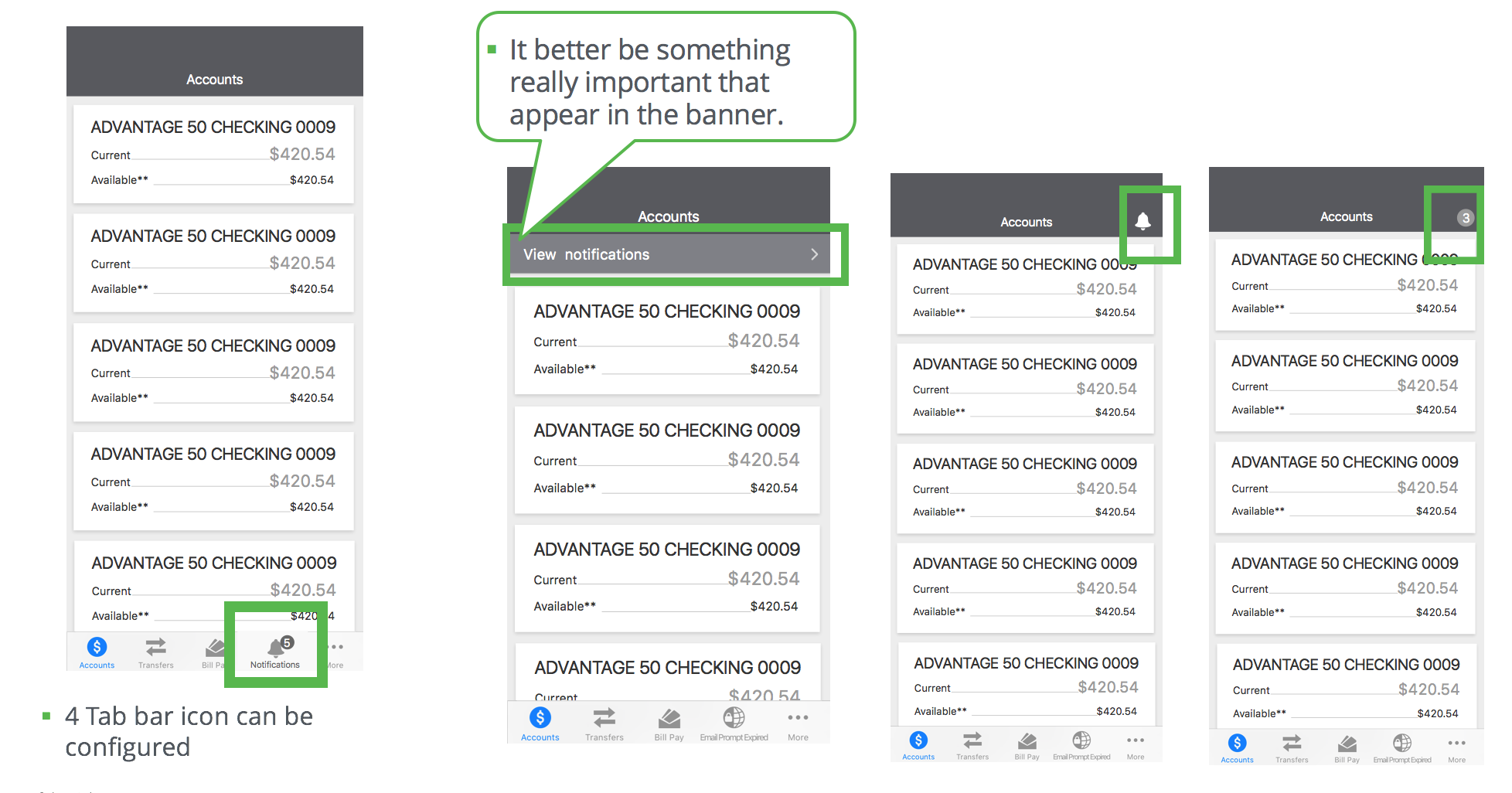
Creating access to messages from the account page was one area leadership wanted to be addressed in the redesign, but there were more opportunities for improvement:
- Is “Messages” the right term to encompass both Alerts like “low balance” and messages like “What’s new”. The desktop product uses “Notifications”
- What were the alerts users cared about?
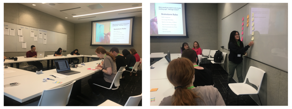
We brought in two key demographic groups to help us uncover some great insights to our key questions, millennials and gen x. We presented a variety of mockups and conducted some brainstorm activities to uncover ways to help improve access to alerts and increase usage of this feature.
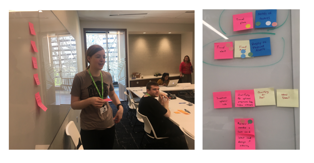
With the feedback we gathered from the focus group and subsequent research, we were able to apply these learnings to optimizing our notification page.
Determining a Log out icon

Now that we added an alert icon to the top left, we created a new problem. A developer pointed out that Apple Human Interface Guideline does not recommend having an icon and a text button together in the nav bar. At the time, we used the “log out” text top right because there was no standard icon for “Log out”.
To determine the best logout icon, we took two popular log out icons to test. For the first task, we created a task based question for the second we asked about preference.
Where would you click to log out of the app?
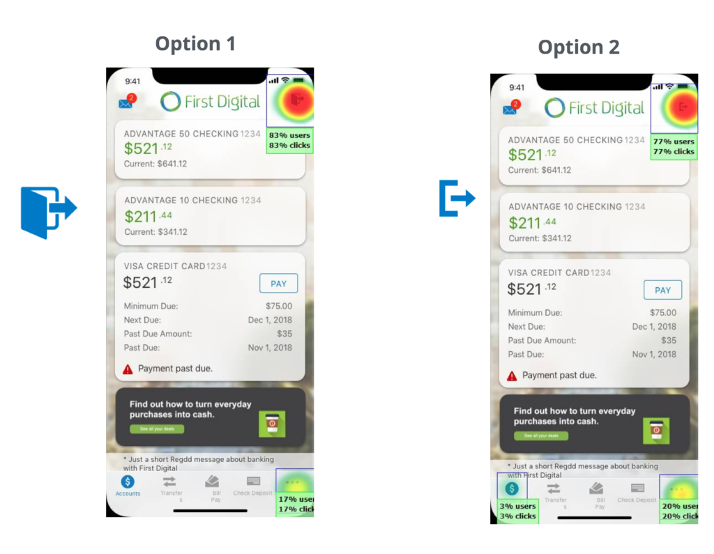
Which log out icon would you prefer to use?
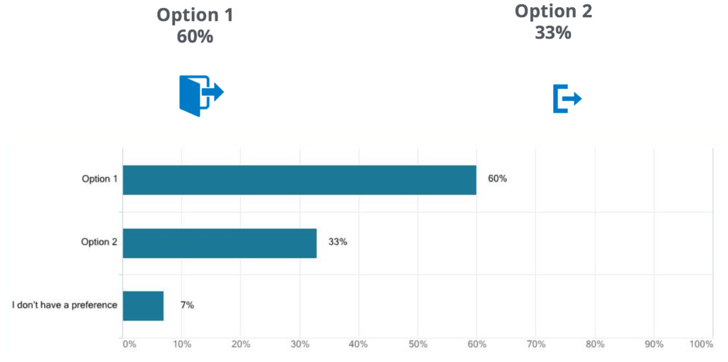
The clear winner in for both questions was the log out icon that resembled a door. This is the one we went with to replace the log out text located in the top right.
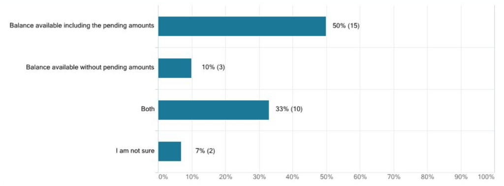
Clarifying Balances

The app showed two balances. One called “Current” and another called “Available”. These balances often confuse users since “Current” is the emphasized amount but does not include pending transactions, nor always accurately reflect what is currently available to spend.
We decided to ask users what do they care about. The winner included pending amounts.
I used the data collected around messages, log out icon, and balances to improve the accounts homepage while also adding some additional opportunities for customers to further push their brand.
Solution for Accounts Page

Account History Page
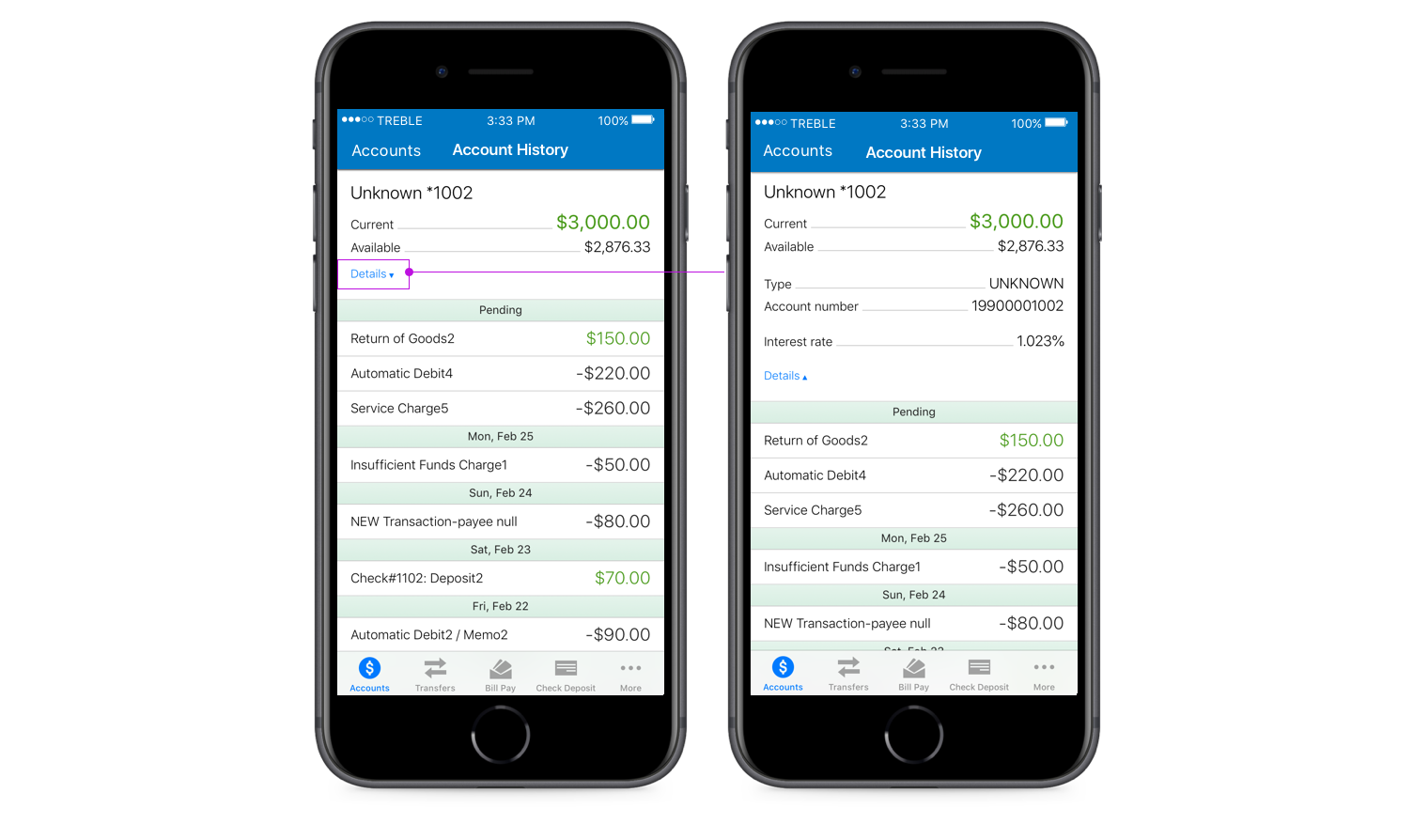
The account history page shows transactions and account details. This page receives the second most usage after the account page. There were several ways we can optimize this page over time:
- Adding the ability to do a transaction search
- Improve format and more details for transactions
- Ability to give an account a nickname
- Provide opportunities for our customers to add additional functionality or display ads
Transaction Search
Like many of our top
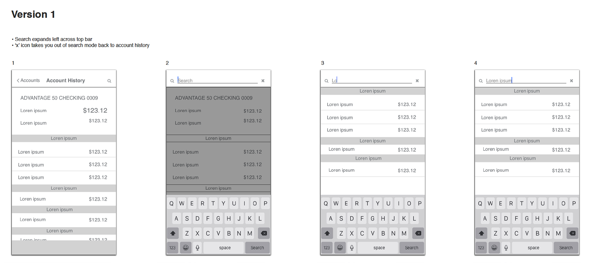
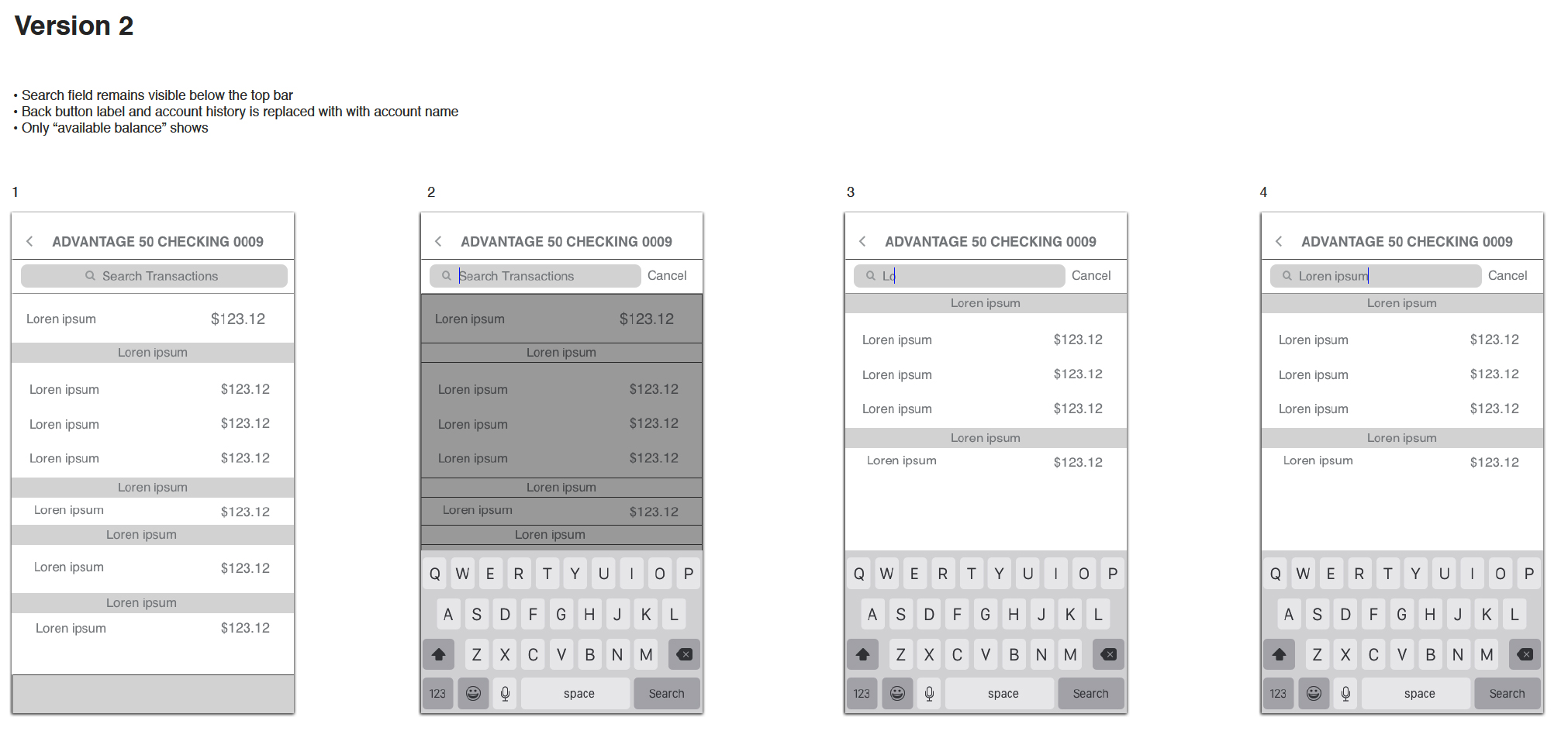
After collaboration with the internal team, we settled on a solution for transaction search flows. We shortly released this update and were amazed at the quick adoption rates.
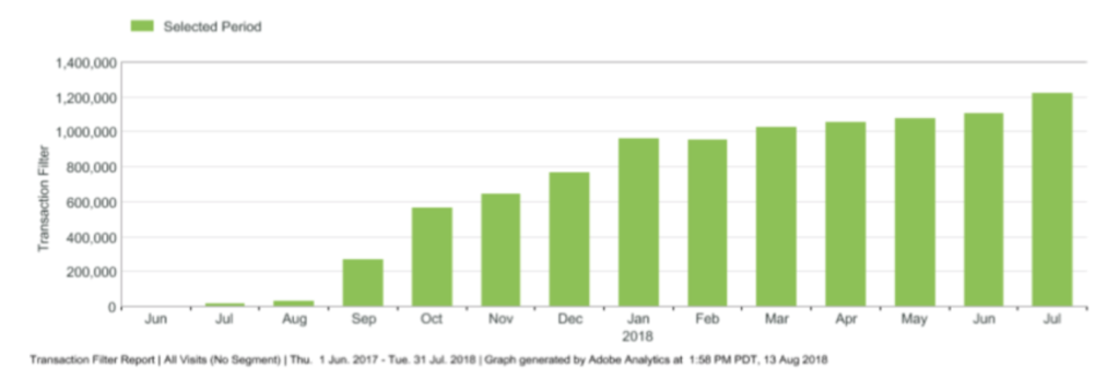
I made a mental note to myself about the high usage for transaction searches and how this could possibly be enhanced during further redesign of this page.
Enhancing transactions
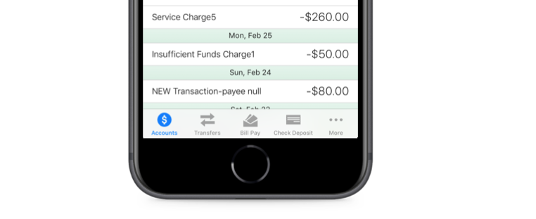
Transactions are pretty straightforward, you show the amount that was credited or debited to an account with an associated transaction. This simplicity was required for the initial product offering, but now we have an opportunity to improve it.
We now wanted to provide transaction details, initiate a dispute, a method to filter transactions and optimize real estate by removing the headers created by each new date. Addressing the aforementioned resulted in this:
Solution for Accounts History Page
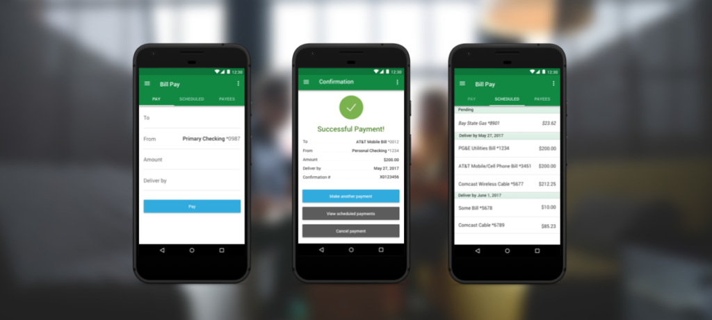
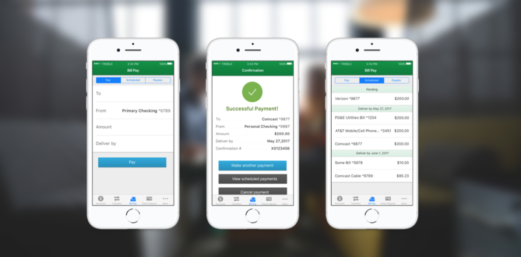
Bill Pay
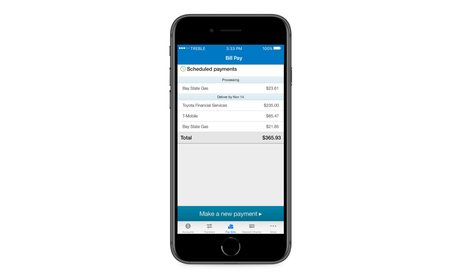
The bill pay feature includes a process for paying bills and viewing scheduled payments.
Mobile Bill pay features were limited and did not allow users to:
- manage payees
- view or file eBills
- create automatic payments
- edit scheduled payments.
This would prove to be one of the most complex improvements. The original design was simple but behind many of our competitors. Adding functionality proved necessary to maintain our reputation as a leader in the industry.
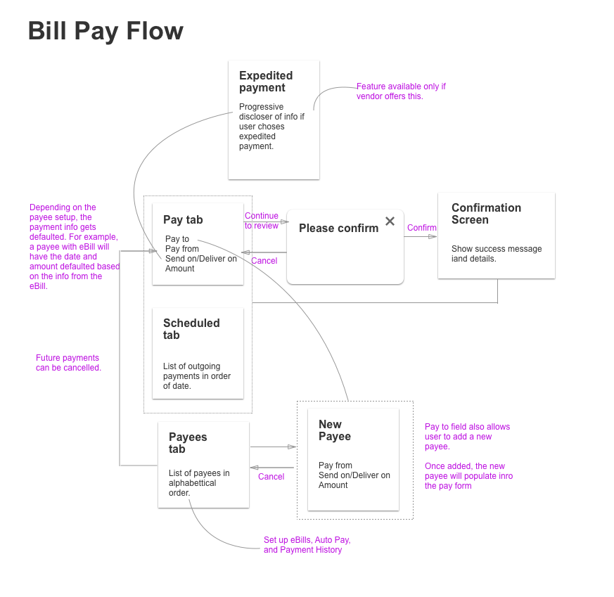
Through the support of my team and PM, we baked in necessary research time with wireframes to validate solutions I designed.
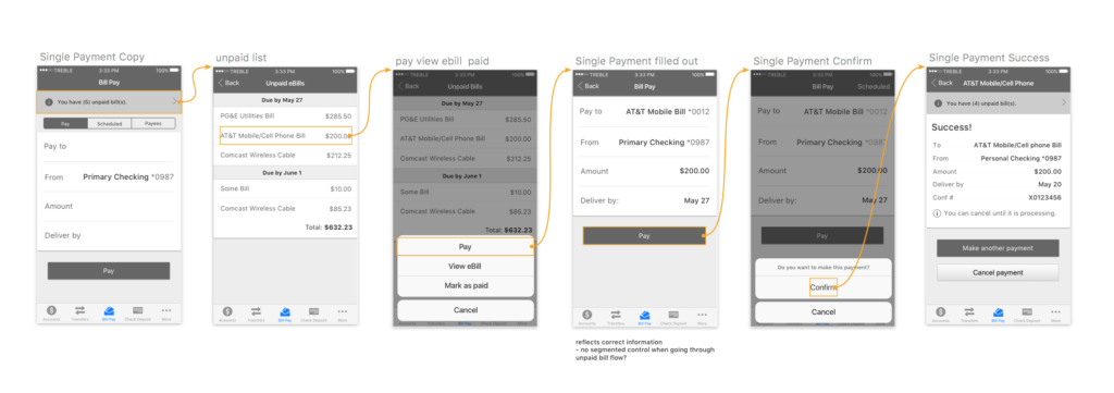
User Research for Bill Pay
Partnering with a UX researcher, we began hosting user research sessions to understand how our users would use mobile bill pay. We visited credit unions and collected feedback and recruited various participants to come into our office and test out three different bill pay flows. We also felt it was important to allow devs to listen to the research. Here’s what we learned:
- Many users do not understand what eBills are
- Users do not know what “File” eBill means
- Making multiple payments in one flow was not important
- Many users are willing to pay a reasonable fee to have a bill overnighted if due soon.
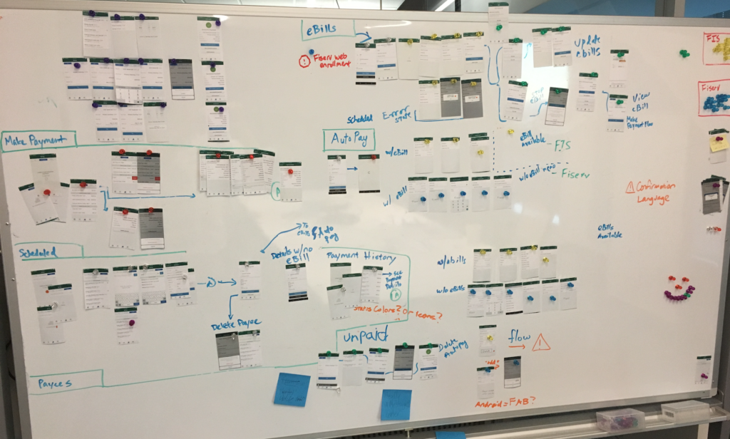
As complexity rose to support numerous flows and two back end systems, the development team and I had to cut out each screen and group them
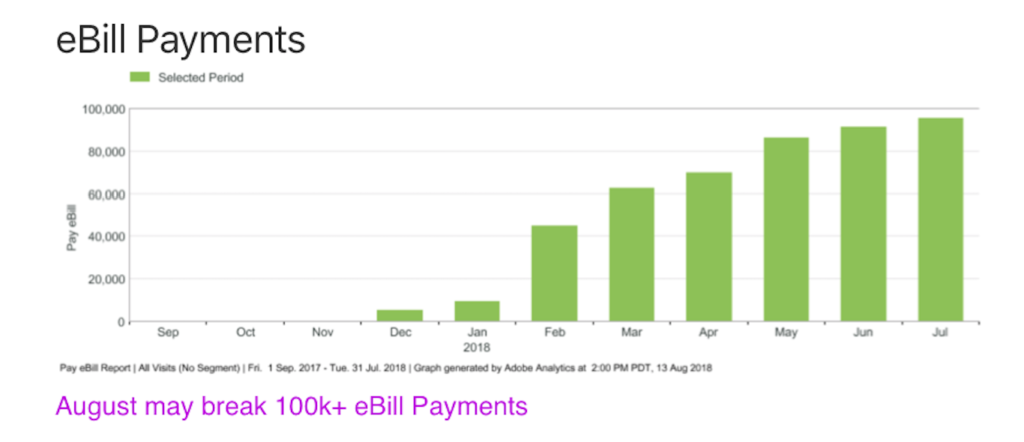
Results
We released a
Solution for Bill Pay